The iPhone SE Review
by Brandon Chester on May 16, 2016 8:00 AM EST- Posted in
- Smartphones
- Apple
- Mobile
- iPhone
- iPhone SE

With the launch of the iPhone 6, Apple had finally tapped into the latent demand for bigger iPhones, and as a result we saw some record-setting quarters from Apple. However, at the same time by moving to a larger display size there was a fairly sizeable audience that was being left behind. While a 4.7" phone is generally a one-handed device for most, there's definitely a sizeable portion of iPhone users that bought the iPhone 5s because the 4-inch size was the largest they could go without facing problems with one-handed usability.
The other challenge that Apple faced was their need to be more competitive at the mid-range. For a lot of people, 300-400 USD is pretty much the most that they can afford to pay for a smartphone, and as a result the value proposition for an iPhone flagship that was two generations behind the latest was increasingly weak in markets like India and China, especially when Xiaomi and Huawei were often shipping the latest and greatest hardware for similar prices. While margin might not be as high in this segment of the market, the volume here can definitely compensate.
With these two issues in mind, this brings us to Apple's newest iPhone, the iPhone SE. As Apple's smaller iPhone, the iPhone SE has two functions. It provides a viable option for users who want a smaller iPhone, and it allows Apple to sell at price points that they can't reach with their larger and more expensive iPhones. This is especially key with Apple's push to increase sales in emerging markets like China and India, as for many people the price of the iPhone 6s and 6s Plus makes them inaccessible. As you'll see, the iPhone SE brings the price of a new iPhone lower than it has ever been before.
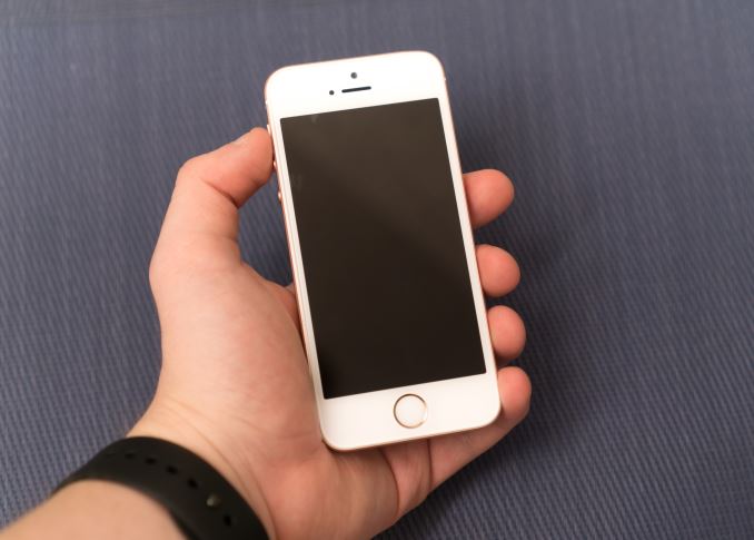
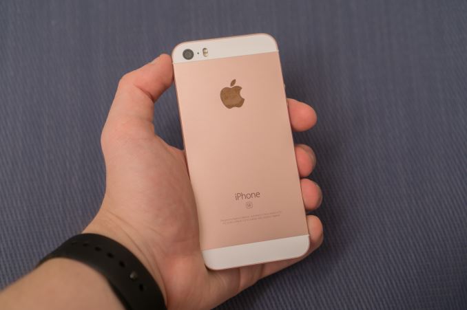
It's probably no surprise at this point, but the iPhone SE is going to be a familiar phone. With essentially the same chassis as the iPhone 5s, the iPhone SE marks the first time that Apple has used the same design in three generations of an iPhone. While the iPhone SE is the same as the iPhone 5s on the outside, Apple has made some serious improvements to what's on the inside. Below you can see how Apple's new 4-inch smartphone compares to its predecessor, and to Apple's flagship iPhone, the iPhone 6s.
| Apple iPhone Line | |||
| Apple iPhone 5s | Apple iPhone SE | Apple iPhone 6s | |
| SoC | Apple A7 2 x 1.3GHz Apple Cyclone |
Apple A9 2 x 1.85GHz Apple Twister |
|
| GPU | PowerVR GX6450 | PowerVR GT7600 | |
| RAM | 1GB LPDDR3 | 2GB LPDDR4 | |
| Display | 4.0-inch 1136 x 640 IPS LCD |
4.7-inch 1334 x 750 IPS LCD |
|
| Size / Mass | 123.8 x 58.6 x 7.6 mm 112 grams |
123.8 x 58.6 x 7.6 mm 113 grams |
138.3 x 67.1 x 7.1 mm 143 grams |
| Camera | Rear Facing 8MP iSight with 1.5µm pixels + True Tone Flash |
Rear Facing 12MP iSight with 1.22µm pixels + True Tone Flash |
|
| Front Facing 1.2MP f/2.4 |
Front Facing 5MP f/2.2 + Retina Flash | ||
| Storage | 16GB 32GB 64GB |
16GB 64GB |
16GB 64GB 128GB |
| I/O | Apple Lightning connector, 3.5mm headset | ||
| WiFi | 2.4/5GHz Dual Band 1x1 802.11n BT 4.2 |
2.4/5GHz Dual Band 1x1 802.11ac BT 4.2, NFC |
2.4/5GHz Dual Band 2x2 802.11ac BT 4.2, NFC |
| Price | 16GB: $449 | 16GB: $399 64GB: $499 |
16GB: $649 64GB: $749 128GB: $849 |
Even if I hadn’t put any images on this page, it’s likely that you’d be able to visualize the design of the iPhone SE. At its core it’s a design that has been around since 2012, with a few tweaks having been made along the way. Despite that, it’s a design that still holds up, and I think the HTC One M7 is the only other device from that time that you can really say that about today.
From an aesthetic point of view, the chassis style of the iPhone 5, 5s, and SE is still one of my favorite smartphone designs. The flat sides, chamfered edges, circular volume buttons, and antenna inserts all make for an elegant look, and in my opinion it’s actually a more visually appealing design than that of the iPhone 6/6s which uses injected plastic antenna lines, chiclet buttons, and a camera hump. On the flip side, the iPhone 6 definitely comes ahead as far as ergonomics are concerned. The flat sides and chamfered edges of the SE make for an elegant design, but when you make a phone with flat edges on all sides you inevitably end up with a somewhat brick-like device that doesn’t conform well to the human hand. The fact that the iPhones with this design have all had displays of 3.5” or 4” lets them get away with this due to their smaller profile, but there’s no denying that the curved iPhone 6 design has a better in-hand feel.
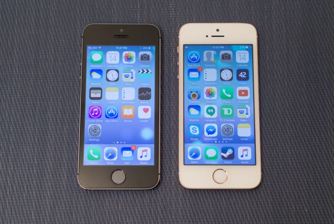
Almost nothing has changed externally going from the iPhone 5s to the SE. The dimensions are unchanged, and the mass has only gone up by a single gram. I've only noticed two changes. The first is the elimination of the regulatory logos from the rear of the chassis, and the second is a change from a shiny chamfered edge to one with a matte finish that matches the rest of the chassis. Beyond that, and the inclusion of the new rose gold color, the design is unchanged from the iPhone 5s.
Going with an older design has some advantages and drawbacks, and some of these end up being the same aspect viewed from two different perspectives. For example, with the SE being a less expensive iPhone in an older design, Apple isn’t pushed to make it the thinnest possible device. While this is arguably a bad thing by Apple’s own standards, it does mean that there’s more space for the battery than if Apple were to slim down the device, and you don’t get a camera hump. The older design does come with a fairly large bezel on the left and right sides of the screen relative to the size of the display itself, and the black space between the white face plate and the actual screen is significantly thicker than on newer iPhones which does make the design look a bit dated.
The iPhone SE may be part of a larger general trend where smartphone designs don’t change as significantly from generation to generation now that the market is maturing. In many ways, having to change your design every year is actually not a good thing, as it implies that your past design had significant flaws that necessitated a brand new one. Samsung’s Galaxy S7 is a good example of this, with the design changes being minimal but noticeable refinements on the existing Galaxy S6 which had a much better design than its predecessors. Good design is long-lasting, and much like how the truly good laptops on the market can keep the same design for many years, smartphones will likely begin to do so as well, with smaller refinements to accommodate new features, and in Apple’s case, a continued reduction in device thickness.
Ultimately, the design of the iPhone 5 and 5s still works, and there aren’t any significant flaws with it that would necessitate a change in design. With it being a well-known and, as Apple puts it, beloved design, it’s not surprising to see it return for a third time in the iPhone SE. While there are some small tweaks like changing the chamfered edge from a reflective to a matte finish, the core design is the same one that Apple’s existing owners of 4” iPhones know and love.


138 Comments
View All Comments
Impulses - Monday, May 16, 2016 - link
Ehh, there's other places you can place a fingerprint sensor and have it be just as effective... The on screen button argument is valid tho, but it's kind of subjective... For video, where they hide away, they're a better choice, for general use it's less advantageous, etc.The biggest rationale for a physical home button continues to be that it allows you to easily wake up the phone while it lays flat, IMO... Though tricks like the "knock on" pioneered by LG can offer an alternative to that.
Let's be honest tho, Apple AND Samsung probably just stick to their guns on the buttons at this point as a sign of pride and/or because it's a recognisable design. They sued the stuffing out of each other in large part over the button and how it ties the design together!
name99 - Monday, May 16, 2016 - link
I suspect the way Apple gets away from the home button (and the area it consumes) is by copying ideas from the Apple Watch.IF they can get ultrasound based fingerprint detection to work well (so that it can work anywhere on the screen) that's REALLY helpful in terms of making the various lockscreen swipes work so much better --- right now it's kinda lame that you swipe on a notification or text message or whatever but then have to go through the unlock screen.
So if they can solve the "no need for a fingerprint button" problem, then, IMHO, the logical way to move forward is to adopt ideas from the Apple Watch. These ideas could include (along with screen lights up on orientation) having a crown sticking out the side of the phone. I don't know how well that would work --- maybe it would be too fragile? --- but it seems like it could be useful in a number of ways, and the sort of UI element that Apple could (at least attempt to) patent the hell out of and fairly aggressively and accurately claim that no-one had done anything like that until they implemented it. If you had a crown like button, apart from the rotating to scroll like on the watch, it could also (like on the watch) act to
- light up the screen
- bring up springboard
- bring up Siri
- bring up the list of previous apps (on watch, at least right now, just the last app) used.
Doing something like this would allow the iPhone to kinda reset. Apple could get off the naming treadmill (so like Macs new ones get released when they are ready, and have names like "iPhone late 2018"), and even change other things they might want to change (maybe it's worth actually switching to USB-C?). Like I said, a reset allows for lotsa things to change all at once, and allows the inevitable bitching and "I'll never buy an Apple product again" idiocy to flame out over one glorious three month period of non-stop internet ranting.
Ratman6161 - Wednesday, May 18, 2016 - link
"So if they can solve the "no need for a fingerprint button" problem". Well, on my Galaxy Note 5 fingerprint recognition works great. And it has a button too. And the ratio of overall size to screen size is better too. All it took to do that was to have an oblong button instead of a big round one. What's the big deal.Ratman6161 - Monday, May 16, 2016 - link
I guess I'll have to hold an SE in my hand to see how they feel relatively speaking. But 12.4 mm Vs 12.7 mm = a difference of .3 mm in height. Same math, .6 mm different width and .13 mm in thickness. From the numbers, its hard for me to visualize there being any significant difference in real world feel. And 4.2 is still > than 4.0, though I guess it all depends on what's important to you.To me, overall the form factor seems essentially the same and as with all these endless debates, in the real world it comes down to personal preference.
name99 - Monday, May 16, 2016 - link
I use both (6 vs 5) frequently. The difference in height, and the difference in edge curvature, are both noticeable, but I would not call one worse or better than the other (though I suspect the width of the 6 with hard edges would be noticeably unpleasant).For me at least, as a guy with big enough pockets and hands, Apple made the right call with the size of the 6. I remain curious as to whether the primary draw of the SE if the smaller screen size (or, more precisely, the smaller area for pockets and handbags) or the lower price --- I've never seen anything definitive either way.
qap - Tuesday, May 17, 2016 - link
Thickness stopped being a limiting factor (for users, not for designers) some time ago. Thicker phone can even be more comfortable in hand. So there is no point in comparing volumes.That leaves footprint and 10% difference means they are direct competitors. In fact (as an example) I am thinking about buying one of them as they are closest to my ideal phone.
Iphone SE is perhaps closer, but display and everything about display is really off-putting. You can fit 4,5" in the same footprint. Even 4,3" and it would be in my pocket already (it can be done - you can look at galaxy s4 mini). But 60% screen-to-body in 2016? And by 2016 standards it's not even a good display (low res, poor blacks).
Eden-K121D - Monday, May 16, 2016 - link
They didn't even post a S7 review part-2 which was released much earlier than the iPhone SE yet the SE review comes first.Yawn. It has nothing new.michael2k - Monday, May 16, 2016 - link
The review they did was sufficient to show you how much faster the SE is than the S7:http://www.anandtech.com/show/10120/the-samsung-ga...
Impulses - Monday, May 16, 2016 - link
Different writers tho, IIRC, not that it's an excuse but it's not like they're purposely prioritizing the SE.whiteiphoneproblems - Monday, May 16, 2016 - link
I love mine! Only (minor) issues are a rattling power button, and a funky auto-brightness that doesn't like turning on to lowest setting in a dark room (never had that problem in an iPhone before).