Nokia Lumia 521: Quality Smartphone on an Extreme Budget
by Vivek Gowri on August 8, 2013 1:08 AM EST- Posted in
- Smartphones
- Nokia
- Mobile
- windows phone 8
- Lumia 520
- Lumia 521
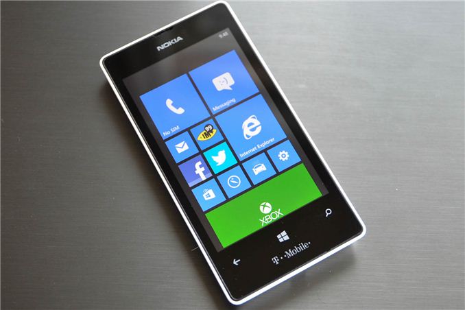
Microsoft is in a difficult place with regards to the smartphone market. After delivering a very innovative interface and overall promising platform with Windows Phone 7 in late 2010, the platform stagnated, with mediocre hardware, slow updates, and not much progress in terms of sales. Bringing Nokia on board in 2011 gave Windows Phone a bit of a boost, particularly after the Windows Phone 8 launch with the success of the Lumia 920, but it’s still hard on a lot of levels to recommend a high-end Windows Phone versus the price-competitive iPhone and Android equivalents. But where I’ve long felt that Windows Phone devices make sense is with lower-end hardware.
And in that context, the Nokia Lumia 521 is very interesting. It’s the T-Mobile US version of the Lumia 520, and ships with AWS HSPA+ for just $129 sans contract or subsidy. It’s nearly identical to the 520 save for very minor dimensional differences and T-Mobile branding. AT&T gets the 520 in its original form as part of their GoPhone prepaid lineup for $99.99, no contract. The specsheet reads pretty respectably given the budget—Qualcomm’s MSM8227 SoC with dual-core Krait at 1GHz clocks, Adreno 305 graphics, 512MB RAM, 8GB of onboard NAND plus a micro SD slot, a 4” WVGA IPS panel, and a 5MP camera with an f/2.4 lens. And of course, this being Nokia, you’re assured of a pretty decent design and build. Nokia has always excelled at building durable, inexpensive handsets that didn’t feel cheap, which is one of the things that has propelled them to success in developing markets.
Microsoft’s insistence on keeping user experience consistent between devices as much as possible has led to some budget WP handsets that have been nearly as good as their more expensive brethren, so the potential has always been there, but this is the first time we’ve seen a Windows handset release at the floor-sweeper price point. So naturally, the Lumia 521 is interesting. The promise of a real smartphone at legitimately accessible price points, without the need to tie yourself into a contract or binding agreement of any kind, is fantastic. Tied in with T-Mobile’s BYOD-friendly no contract plans, this is actually a pretty credible handset for the tight of budget. AT&T’s $99 520 is even more ridiculous considering it doesn’t even break the century bill mark.
The only real difference between the 520 and 521 externally is the latter being 4.1mm taller in order to fit the T-Mobile logo at the bottom of the front face (124.0mm for the 521 versus 119.9mm for the international and AT&T versions of the 520). Beyond that, they share the same width, thickness, overall design and construction, and specs.
| Physical Comparison | ||||
| Nokia Lumia 521 | Nokia Lumia 520 | Nokia Lumia 920 | HTC 8X (International) | |
| Height | 124.0 mm (4.88") | 119.9 mm (4.72") | 130.3 mm (5.13") | 132.35 mm (5.21") |
| Width | 64.0 mm (2.52") | 64.0 mm (2.52") | 70.8 mm (2.79") | 66.2 mm (2.61") |
| Depth | 9.9 mm (0.39") | 9.9 mm (0.39") | 10.7 mm (0.42") | 10.12 mm (0.4") |
| Weight | 124 g (4.37 oz) | 124 g (4.37 oz) | 185 g (6.53 oz) | 130 g (4.59 oz) |
| CPU | 1 GHz MSM8227 (Dual Core Krait) | 1 GHz MSM8227 (Dual Core Krait) | 1.5 GHz Qualcomm MSM8960 (Dual Core Krait) | 1.5 GHz Qualcomm MSM8260A (Dual Core Krait) |
| GPU | Adreno 305 | Adreno 305 | Adreno 225 | Adreno 225 |
| RAM | 512 MB LPDDR2 | 512 MB LPDDR2 | 1 GB LPDDR2 | 1 GB LPDDR2 |
| NAND | 8 GB NAND with microSD slot | 8 GB NAND with with microSD slot | 32 GB NAND | 16 GB NAND |
| Camera | 5.0 MP, f/2.4 lens | 5.0 MP, f/2.4 lens | 8.7 MP, dual LED Flash + 1.3 MP front facing | 8 MP, LED Flash + 2.1 MP front facing |
| Screen | 4" 800x480 LED backlit IPS LCD | 4" 800x480 LED backlit IPS LCD | 4.5" 1280 x 768 IPS | 4.3" 1280 x 720 SLCD2 |
| Battery | Removable 5.29 Whr | Removable 5.29 Whr | Internal 7.4 Whr | Internal 6.8 Whr |
The 521 speclist hits a few major points that I’d consider pretty important in delivering a satisfactory mobile experience—IPS display, fast lens, a reasonably powerful SoC, expandable storage (in lieu of a sizeable amount of onboard NAND). Notable omissions include DC-HSPA+, a front-facing camera, a flash module, NFC, and wireless charging, but on paper it would seem that Nokia didn’t cut too many corners in their pursuit of a bargain smartphone.
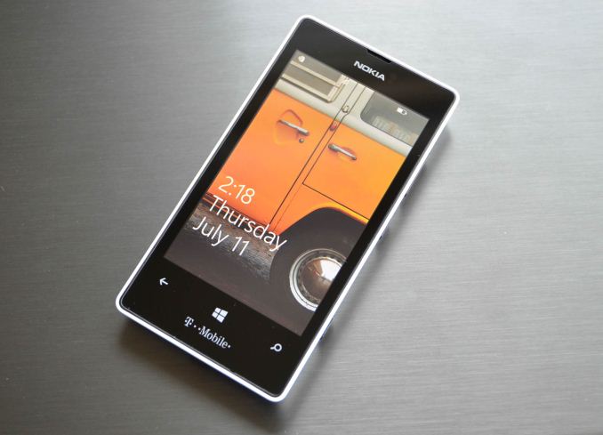
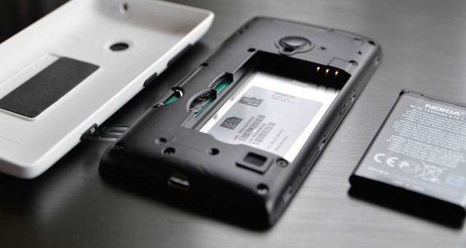
The 521 is a good looking phone, with a wraparound battery cover that fits around the main body of the phone. Conceptually, it’s pretty similar to how the HTC 8X is put together, except that the entire thing is meant to come apart, giving users access to the battery as well as the micro SIM and micro SD card slots. Nokia has used this construction before with the 820 and 620, so it was no surprise to see it on the 520 and 521. The design language is very Nokia, with an organically contoured back and an elegant simplicity to the overall aesthetic. It manages to be understated without feeling plain, which Nokia has gotten very good at. It’s really not much of a question, but Nokia’s team of designers and engineers is truly world class—Nokia is the only company with the hardware level design chops to match Apple (though recently, HTC and Microsoft have shown promise as well).
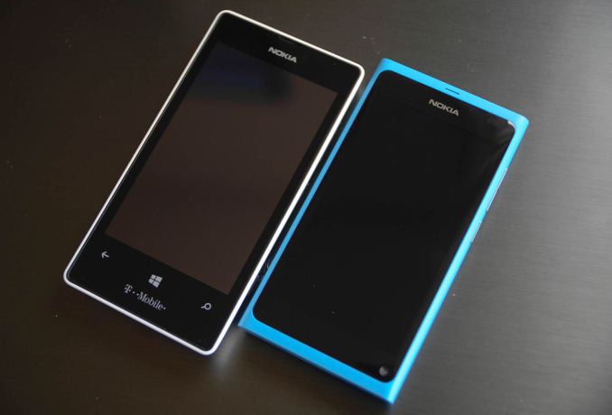
In hand feel is actually really great—the 521 isn’t the thinnest handset in the world, but the 4” display gives it a very compact frame that’s a nice change from the 4.5-5” flagships of late. The ergonomics of the curved back are good, the phone just fits into your hand very well. The phone is light, but not unnaturally so—at 125g, it’s pretty reasonable for the size. It’s a bit odd to look at the 521 next to the brick-like Lumia 920, which has a 4.5” display and weighs a kind of ridiculous 185g; there’s very little family resemblance between the two. (It’s actually even more shocking to look at the 920 versus the svelteness of the same design language on the Lumia 800 and MeeGo-based N9, but that’s a different matter.)
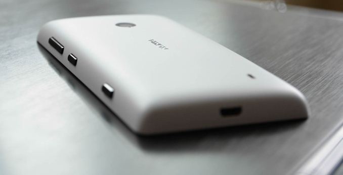
The battery cover is a matte polycarbonate shell, in this case white. The 520 battery cover is offered with five different color shells—the classic Nokia cyan, yellow, red, black, and white—though due to the height difference, those shells won’t fit the 521 (I was heartbroken when I discovered this). There has been no word on any colored shells being offered for the 521 thus far, so I wouldn’t hold my breath.
The shell has the glossy black buttons attached to it, laid out in the traditional Lumia style of volume, power, and camera all on the left side of the handset. I’ve actually never really liked the setup in the past, because the flush chrome buttons on the side of the Lumia 800 and 900 were easy to mix up on accident. This got fixed to some degree with the 920, which added more space between the buttons, but the 521 goes a step further with generously-sized buttons that stick out from the sides by about a millimeter. It’s very easy to grab the right one by feel, and the buttons actuate with a positive click. There’s more travel to the buttons, which is nice and refreshingly old-school. The camera button, particularly, is awesome—it’s rare to find good two-stage camera buttons these days; this is probably the best I’ve seen in a couple of years. It sticks out a bit further than the other buttons and offers good feedback for both clicks.
The battery cover peels off the back of the phone pretty easily, exposing the sparse guts of the phone. There’s a hole in the shell for the camera lens, with some rubber padding in various places (around the camera module, speaker, and battery) to quell vibrations and offer a bit of protection. The interior of the phone is shockingly plain, with nary an extra screw, sticker, or plastic feature in sight. Penny pinching also probably led to the odd SIM-card insertion method—it isn’t spring loaded (neither is the microSD card slot), so you need to push the SIM card out from the plastic cutout. It’s not a problem, but it’s just evident that places like this are where every last cent had to be saved to hit the $129 price point.
Overall, the design is very pleasant. It’s clearly not high-end hardware, but it doesn’t try to be. It’s very solidly a budget handset, but a few cuts above what you get from Huawei and the like at this price point. This is Nokia at its best—focusing their hardware prowess on quality devices that don’t break the bank. The smartphone is a niche that has yet to be fully tapped in the emerging world, and offering a compelling handset like the 520 is key to Nokia’s future.




116 Comments
View All Comments
textomatic - Thursday, August 8, 2013 - link
To close down an app keep hitting the back button until you're out of that app.You can only navigate back in the browser. No going forward. Their is a third party app called UC Browser that does let you navigate backwards and forward.
Krysto - Thursday, August 8, 2013 - link
Seems like a loss leader for Nokia.Gunbuster - Thursday, August 8, 2013 - link
I highly doubt it. It's just the other high end models they really rape you on. Do you think they put some unicorn horn or magic fairy dust in a Lumia 925 or Galaxy S4 that makes is cost over six times as much to produce? Nope, they are just making a bunch of profit from people who don't realize the "Free", "$99", or "$200" on contract phone is really priced at $400, $500, or $600+Shadowmaster625 - Thursday, August 8, 2013 - link
I really do not understand the review philosophy.... this phone seems like it compares best with a Galaxy S2 in terms of features, price, and performance, yet there are no charts comparing them. Scratches head. Why would I want to know how this thing compares to an S3 when an S3 is still over $200?toraji - Friday, August 9, 2013 - link
very good point shadowmaster, I think it is hard to admit that the 520 and 521 are just block busters so they need to find some strange comparisons to cover up their biased opinion and as far as I am concerned it is not working because the 520 and the 521 are just best in class.there is nothing to compare to be honestdirtyvu - Thursday, August 8, 2013 - link
don't forget that this includes the full Nokia suite of apps including the HERE maps (powered by Navteq whose maps power most GPS devices such as Garmin). even if you don't get cell phone service or a data plan, you have full turn-by-turn offline navigation as long as you've already downloaded the maps (and you can do that over wifi). the whole US takes up about 2.6 GB. California takes up about 250 MB. so not bad. for $100-129, you get a good GPS device at the very least which can then be used as a cell phone if you so choose.Death666Angel - Thursday, August 8, 2013 - link
Very cool feature indeed. I'm not a driver, so those things pass me by very easily. If I were, that would definitely play a role in my purchasing decision.toraji - Friday, August 9, 2013 - link
if you are not a driver you might be a walker, there are 3 different apps included for people that do not drive, transfer, city lens and here maps AWESOME way to find your destination :o)toraji - Friday, August 9, 2013 - link
I would not recommend downloading us maps because it takes up valuable space, I would only download maps for places where I do not have data coverage or while I am roamingdirtyvu - Friday, August 9, 2013 - link
being able to download whole countries is a very good feature. other mapping systems don't offer that. you can download only a very small map with Google Maps. and the device does accept 64GB MicroSD cards. I'd rather use the space for maps than for things like Angry Birds. for me, the most important uses would be navigation, phone calls, email, and web browsing.