The Apple iOS 9 Review
by Brandon Chester on September 16, 2015 8:00 AM EST- Posted in
- Smartphones
- Apple
- Mobile
- Tablets
- iOS 9
UI And System Changes
With every major release of iOS Apple makes various changes to the interface. This has been especially true with both major and minor updates that have come after the launch of iOS 7. With Apple redesigning iOS in what is rumored to have been less than a year, there were naturally areas that weren’t polished or didn’t fit in. This section just covers some of the more major visual and functional changes to the various aspects of iOS.
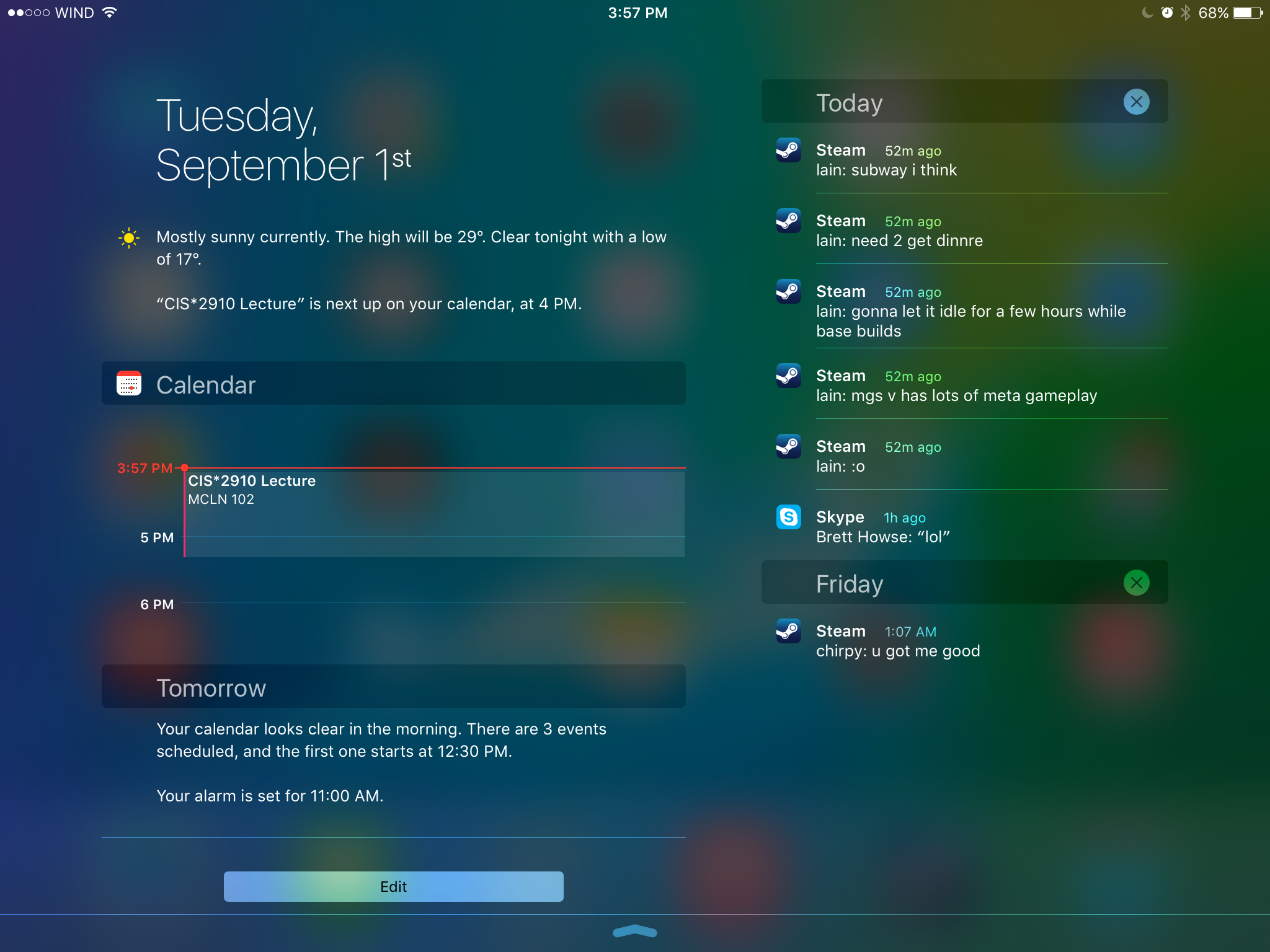
One of the first major changes I noticed in iOS 9 was the new Notification Center layout when in landscape orientation on the iPad. Since there’s enough horizontal space to do so, Apple has segmented the drawer into two sections, with the today view and widgets on the left, and notifications on the right. I’m surprised it took this long for someone to do this, as it has always seemed like an obvious way to use the space in landscape, rather than simply having a bunch of empty space on the sides or stretching the interface to fill the width of the display.
One other thing to note is that notifications now sort by time, and also by date. Previously the notifications still sorted “by time”, but they were also grouped by app. This meant that they didn’t really sort by time in the way you would expect. The group by app feature is now optional, and disabled by default. Notifications are now sorted by when they arrive, and while you still can’t close them all at once, you can delete them by day which ends up being pretty quick. I know the sorting of notifications has been a long source of pain on iOS, particularly among Android users moving to iOS who were used to the sensible time based manner than Android has always used to sort notifications, and it’s good to finally see it changed.

As for the today view, there aren’t many big changes. The one addition that I did notice is a new battery widget, which shows the battery life of devices connected via Bluetooth. This was obviously added with the Apple Watch in mind, but it also applies to other devices like Bluetooth keyboards, speakers, and headsets. It’s important to keep in mind that your Bluetooth device has to report its battery life to the host device in order for this to work. You’ll know if it does if you’ve ever seen a small battery symbol next to the Bluetooth logo in the status bar when your device was connected. For example, I have a Plantronics and a Creative headset here that do show up in the battery widget, but a pair of Sony headphones and an older Creative set that do not.
The recent apps switcher receives a big visual overhaul in iOS 9. Long ago it was a bar at the bottom with app icons, and with iOS 7 it was changed to a list of icons with cards to preview the application. It reminded me a lot of the Windows Phone recent apps list, but it was a much better implementation. This time around it seems that Apple has taken a bit of inspiration from the recent apps tray introduced in Android Lollipop which has a scrolling stack of app preview cards that are overlaid. The iOS recent apps tray is basically the exact same thing, but scrolling sideways instead of forward and back. It works fine, although I don’t know what necessitated the change apart from the old style being really difficult to run smoothly on a device like the iPad due to the requirement of high resolution app previews being entirely loaded into memory.
One consequence of the fact that the recent apps tray now scrolls left initially rather than right is that the direction of the four finger app switching gesture on the iPad is now reversed. I still find myself swiping to the left with four fingers to get my last used app on screen, but this just results in a bouncing overscroll effect as you now need to swipe right with four fingers. I understand Apple’s reasoning, as moving your thumb to the right when holding a phone in your right hand is more ergonomic than moving it left, and this works with the new app switching gesture enabled by 3D Touch on the iPhone 6s, but it does cause a bit of confusion at times if you're used to using that gesture on an iPad.
Something that has been greatly improved about the recent apps list is how you access applications that are being handed off from another device. With the old tray, you accessed it by swiping to the left of the card that had the home screen on it. This meant that if you weren’t at the very beginning of the list you had to scroll all the way back. In iOS 9 you complete the handoff of an application simply by pulling up on a card shown at the bottom of the display. Apple has also used this same interface to show the music app when you have a pair of headphones or a speaker connected via Bluetooth or the 3.5mm jack. I’ve found this very useful when switching from an application to the music app, as it removes the need to go to the home screen to find and select it there.
The last thing I wanted to mention about the new recent apps tray is that the recent contacts list at the top has been removed. I mentioned in my iOS 8 review that it wasn't very useful and that I had never used it, and it looks like I wasn’t the only one who felt that way.
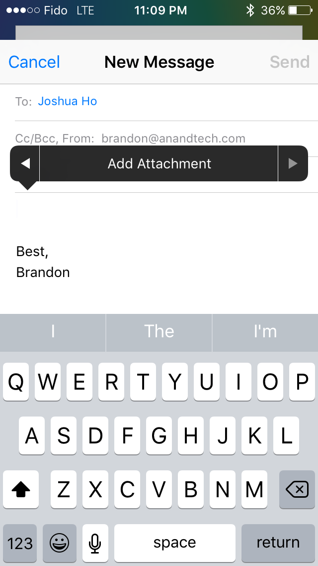
Some of the included iOS apps receive some notable improvements as well. Mail now allows you to include more than five photos in a message which is a long overdue removal of an antiquated constraint. You can also add attachments now, which you select from iCloud Drive. Searching through mail is also much better as well. Previously it would just show you every message that corresponded to the keywords you entered. The search now gives you a list of thread topics that match, and if those aren't sufficient you then have the option to use the older individual message view.
Apple's Photos app gets a couple of upgrades too. There's now a scrubber at the bottom of the iPhone version of the app which allows you to quickly go through photos. The functionality of the scrubber is slightly different from the older version on the iPad, as it accelerates the movement through photos much more quickly. You can also select multiple photos in an easier manner by pressing on one and dragging left or right to select images in a row, and up or down to select an entire row.
There are other visual and functional changes all over the place, and it’s impossible to document them all. A few others that I felt are worth mentioning include a significantly more rounded share and overflow menu with a separated cancel button, 4x4 folders on the iPad, the ability to set your recording resolution to 720p in the settings app in order to reduce the space taken by videos, and the ability to have caller ID guesses made based on emails you’ve received.
Ultimately, there are no revolutionary improvements to the interface among the changes that I’ve highlighted here. The new visual appearance that came with iOS 7 appears to have matured by this point, and now Apple is making refinements to how things look, and improving how things work. I think most of the changes I’ve found and discussed here are for the better, even when they’re removing something like the recent contacts in the multitasking tray. If you’re not a fan of the design of iOS your opinion isn’t likely to change with iOS 9, but if you do enjoy it then you’ll be getting some nice visual and functional improvements throughout the system.
A New System Font
Both OS X and iOS have made some major changes to the system font in recent years. iOS moved from Helvetica to Helvetica Neue on Retina devices in iOS 4, with non-Retina devices moving to the thinner weighted Helvetica Neue alongside the Retina devices in iOS 7. OS X changed from Lucida Grande to Helvetica Neue with OS X Yosemite. This year both operating systems are adopting Apple's San Francisco font. Technically this is different than the San Francisco font used on the Apple Watch, which is a result of the different circumstances and sizes that will be used on an iPhone, iPad, and Mac compared to a smartwatch. Specifically, the San Francisco Compact font used on the Apple Watch has flat edges to letters like e, a, and o have flat edges that put more space between them and other characters to improve legibility.
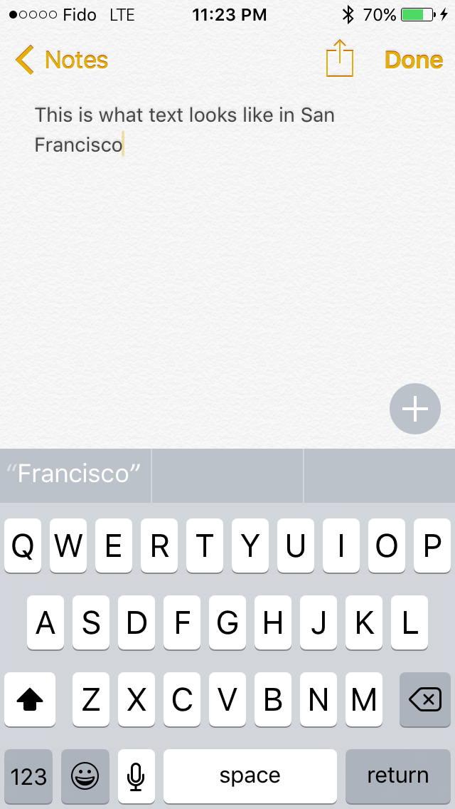

To be honest, I'm not the best person to give commentary on what's good and bad about Apple's new typeface. While I can see and understand the differences between fonts, I find it difficult to articulate exactly what makes a font look and feel different from another similar font. My first impression when using San Francisco was that characters seem more rounded than those in Helvetica Neue, and the spacing between them is greater. After using iOS 9 for quite some time I've grown completely used to them, and the initial surprise of having a different looking font everywhere actually wore off after a couple days. To learn a whole lot more about San Francisco and the process of designing it I would check out Apple's WWDC session that was dedicated to discussing it.


227 Comments
View All Comments
Speedfriend - Thursday, September 17, 2015 - link
@melgross I have recently seen numerous tablets being used by businesses (restaurants, delivery companies) that were clearly no-name Android tablets designed for that specific tasks. Why would a corporate that needs a tablet for a single task buy a $500 iPad when they can get a $200 Android?iPad is now caught in the middle between cheap single task Androids and multi-task windowns 2-in-1s. Our CEO is obsessed with Apple products but we have gone Windows tablets and it looks like we are going to go full surface range soon (3 and Pros). Why, because an iPad is too limited even as something you just take to meetings with you.
FunBunny2 - Wednesday, September 16, 2015 - link
-- a respected history of hardware-design and innovation..really, really now? Apple has always bought their silicon, 99.44% is off-the-shelf. Yeah, I know, the fanbois brag that the Ax chips are somehow blessed by Apple. Fact is: Apple only tweaked around the edges, using industry standard silicon design tools, a bit of cache added here and there. Just look at the BoM from any of the usual teardown sites. You'll see the fact: it's always other people's parts.
osxandwindows - Wednesday, September 16, 2015 - link
So why is apple not using 8core chips ha?Intervenator - Wednesday, September 16, 2015 - link
I hope that post was sarcastic or it would really be funny.damianrobertjones - Thursday, September 17, 2015 - link
...Because that would be too far a jump. Apple wants to MILK its customers for everything then can hence the small updates. Someone like Nokia committed a mortal sin as they released a 41Mp (36+5mp) camera phone while others are still messing with 20Mp.All about the cash.
P.s. Android NEEDS more cores as it runs like a bag of crap.
calden - Monday, September 28, 2015 - link
Actually Android runs just as smooth as iOS. The problem is skinned, custom versions of Android, i.e. TouchWiz. When I replaced TouchWiz with CM 12.1 on my Note 4, the system took up only 580MB, where as TouchWiz took up more than 1.5GB before a single app was even installed. I also installed the launcher SmartLauncher 3, the whole experience is lightning fast. Even when running multiple apps in the background, something iOS still can't do. I think it is ridiculous that a modern OS in 2015 cannot do something as simple as stream a movie to your TV and still allow you to use the device, iOS simply pauses, even disconnects the stream in some cases if you want to do something as simple as look up an actors name in IMDB. With my Android tablet I can not only stream a film to my TV but play a game like Modern Combat 5 at the same time. As a programmer I need to run a terminal app to stay connected to my firms server during trading hours as I have monitoring tools. IOS has terminal apps as well but I can't run them them in the background the entire day without iOS terminating it's connections. Again, I find this to be absolutely ridiculous as who wants to stare at a terminal the entire day, especially when I need access to my tablet or phone to do other tasks. Apple adding Pro behind the iPad doesn't automatically make it a pro device. IOS still has one of the worst document, file management systems on the market today. My Nokia 9500 from 2004 is light years better than what iOS provides, apps should never be allowed to manage their own files. Default apps, I still can't change the default apps in iOS, why? I have no use for Apple's included apps, if I had the choice I would immediately delete them from the system, as such I need the ability to select my own browser, email client, messenger, media player, etc. as the default applications. I find this tactic of not being able to select my own default apps in iOS highly anti-competitive. The EU went after Microsoft for including Internet Explorer in XP, even though the user had the option of choosing another browser as their default. Why hasn't Apple be scrutinized about this?calden - Monday, September 28, 2015 - link
I'm aware of those few audio and GPS apps that can run in the background in IOS, but this is a far cry than allowing any app that the user needs in the background. No, this has nothing to do with battery life, if it is than Apple really needs to rewrite iOS. My BlackBerry Passport, running three apps in the background, easily lasts the entire day on a single charge, actually it lasts a day and a half with moderate to heavy use. Android has the ability to select how many apps are allowed to run in the background, you can even set it to 1. So if people feel like their apps are eating up their battery they can control the amount of running apps. Apple could easily implement such a feature, they don't though, which means they have all the control, they dictate how the user uses their own devices. iOS is a wolf in sheep's clothing, looks pretty, inviting but once you start to do real work you encounter a brick wall a 20 stories high. How many times have you iOS users logged into iCloud on your device, I had to do it over 25 times to cover every app. Why, why do I need to log in even twice, once should be enough, in Android upon setting up my Google user that was it, from that point on every app that could communicate with Google Drive would automatically be setup. This is because the apps talk to the system at the lowest level, iOS requires spaghetti API's, a spiderweb of tunnels trying to pass info to each other. The Share TO function in iOS works only if the app dveloper has created a share profile. Why can't the system just dynamically create these Share To lists like Android 5.1.2, SailFish 2.0, Windows Mobile 10, BlackBerry OS 10.3.2 by looking for every compatible app that is installed and than listing. No, instead iOS uses this half ass API system. What about mult-user support, will never happen in iOS because of the way it handles files. To support multi-users in iOS each user would have to reinstall each app over again to distinguish each users. They could embed the users info in the file's metadata so the app can distinguish each user but that is just hacky at best would and how would these modified files react when used on other systems. IOS is definitely not a pro system and anyone thinking differently is either lying to themselves to protect their beloved Apple brand, aren't professionals themselves so don't reall understand the meaning or are working around these limitations, fighting the system at every point to get their work done which falls in line with point one, their lying to themselves.I'm not saying that iOS devices don't have their uses, they do. They make great consumer devices for media consumption, social media, gaming, drawing and other artistic apps, music and music creation, etc. However as a productivity tool these devices are highly limited and can't compete with the likes of a Surface Pro 3 or even Surface 3. Even an Android tablet would be a better option. With my Nexus 9 I can log into the LDAP and gain access to all my allowed users NAS storage, mount it as a local asset. Set file extensions to open up certain apps, etc. Trying to do this in iOS is like trying to put a round peg into a square one. You can do it with a bit of force but your going against it's designed purpose. Apple needs to completely rewrite iOS, combine many functions found in OSX before I would ever consider using another mobile device from Apple.
mikhapop - Monday, September 28, 2015 - link
you really nailed it, i am a web developer and i often fail to tell my friends how the ios is very limiting for even the basic stuff (my basic stuff). android is far better as far as the os go. Now i am using a surface pro 3 and never looked back, very good in meetings, and it is now my main machine for 98% of my work.blackcrayon - Wednesday, September 16, 2015 - link
Sounds like you know close to nothing about the Ax chips. They are custom Apple designs, and they also optimize their OS for them. I bet you thought Intrinsity and PA Semi were just marketing facades that didn't actually do anything before Apple acquired them years ago, right?KoolAidMan1 - Wednesday, September 16, 2015 - link
Apple spent billions acquiring semiconductor companies and is one of the few companies along with Qualcomm that has a license to make ARM chips. Anand himself highlighted this while showing that Apple's custom designs matched or exceeded Intel's Bay Trail.You really think their custom designs are something to be dismissed just because of the name on the package? The fanboy is strong in your posts